Don’t Forget the Text
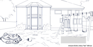
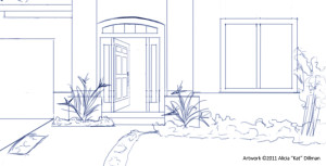
Though I can’t show you the text I can show you were it is going to go. One of the tricks in illustrating a picture book is the leave space for the text without leaving a gaping whole in your illustration.
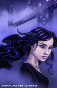
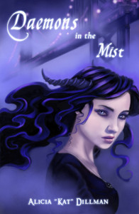
When I plan out an story illustration I always have a layer with the text on it in the size the publisher has said it will be. This way I don’t have to guess and hope it will fit in the end. This also goes for book covers. Where the text is going to appear you also want the colors to be [tooltip text=”This means that the value of the colors in a particular area are relatively the same value”]low contrast[/tooltip] so either dark with light text or vice versa.
Zooming in for Effect
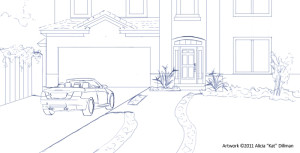
When illustrating a picture book you don’t always have to have crazy angles for every shot. Take a queue from the film industry and go in for some close ups. If your working on a computer you don’t even have to re-sketch your scene just use a free-transform tool to expand your image. I wouldn’t advise doing this with a painted image in most cases because of [tooltip text=”Pixelation is when you blow up or expand an image and the pixels, the bits of color information that make up your image, become jagged and much more visible.”]pixelation[/tooltip].
[box type=”shadow”]
Digital Tool Tip
When using the free-transform tool in Painter or Photoshop remember to hold down shift while moving the arrows on the box the tool creates. This will ensure your image scales proportionally.
This concludes the fourth segment of The Making of a Picture Book. Thank you for joining me on this journey and I hope you will join me again for further installments.
